
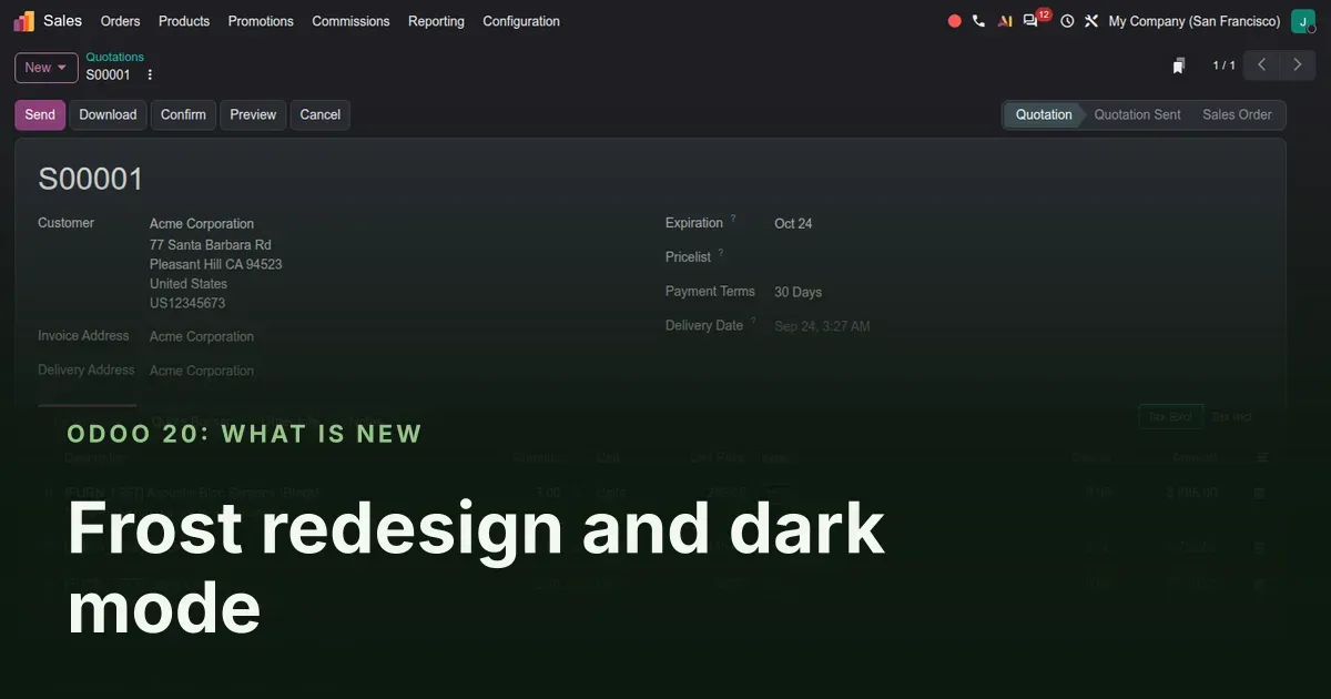
One new look for every screen, not a coat of paint on a few
Odoo 20 ships with a visual refresh that Odoo's designers call "Frost". According to the 20.0 commit history it touches the form, list, kanban, graph, pivot, calendar and Gantt views and the control panel above them, across the Enterprise web client. Put a 20.0 database next to a 19.0 one and the difference is immediate: lighter backgrounds, softer borders, new app icons, and a search bar row that holds the filters, the record counter and the view switcher without crowding. Dark mode becomes a stored preference with three values, System, Light and Dark, and two small additions arrive with it: relative date filters and a notice an administrator can pin above the app icons.
This post is for every Odoo user, and above all for the person who will have to retrain a team after the upgrade. We walk through the home menu, the list and form views, the theme setting, the smart date filters and the administrator notice, then give you a "Where did it go?" table to hand out on day one. Everything here was clicked through on the pre-release 20.0 Enterprise build with the Sales app, in both themes, at the same window size.
Observed on the Odoo 20.0 Enterprise pre-release build of September 23, 2026. Names, menus and availability can change before general availability; we will update this page when they do.
The home menu: new icons, a light dotted canvas and a place for notices
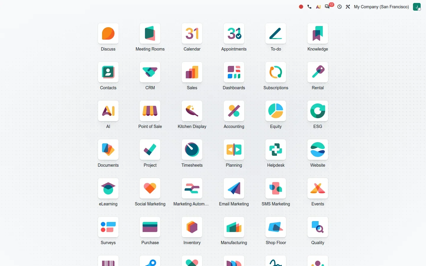
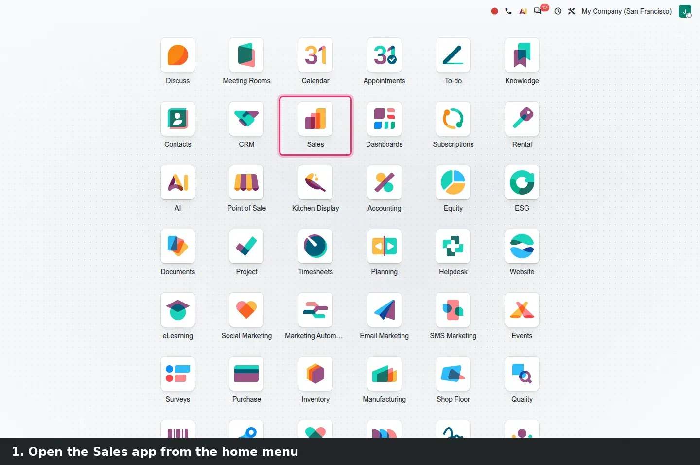
The first screen after login is the home menu, the grid of app icons. On the pre-release build it sits on a pale dotted background with the Frost icons: rounded white tiles, one bold shape per app, in teal, coral and plum. The grid itself has not moved: Discuss, Calendar, Contacts, CRM, Sales, Accounting and the rest are where a 19.0 user expects them. What changes is how the tiles read: simpler shapes and colours that stay consistent from one app to the next, which helps on a crowded screen with forty apps installed.
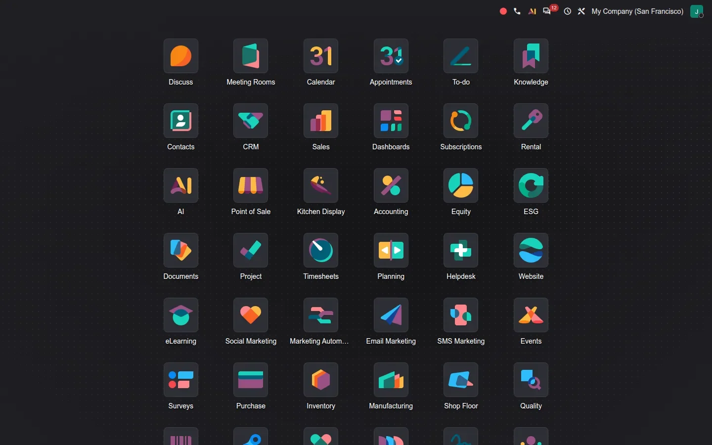
The dark theme redraws the same grid on a dark ground while keeping the icon colours, so the home menu stays recognisable when a user switches. Tiles, labels and top bar sit in the same positions in both shots.
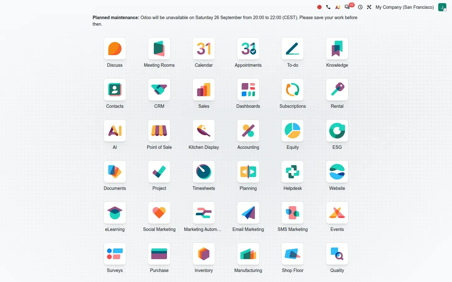
New in this build: an administrator can display a message above the app grid by creating the sysadmin.message system parameter. On the demo we used it for a planned maintenance notice, and every user saw it on the home menu without an email going out. One detail the guide does not mention: the parameter must hold JSON, not plain text, for example {"message": "<b>Planned maintenance</b> ...", "warning_type": "user"}. Plain text is rejected and only logged as "Failed to load sysadmin.message". Setting warning_type to admin shows the notice to administrators only.
List and form views: the same buttons, a calmer row above them
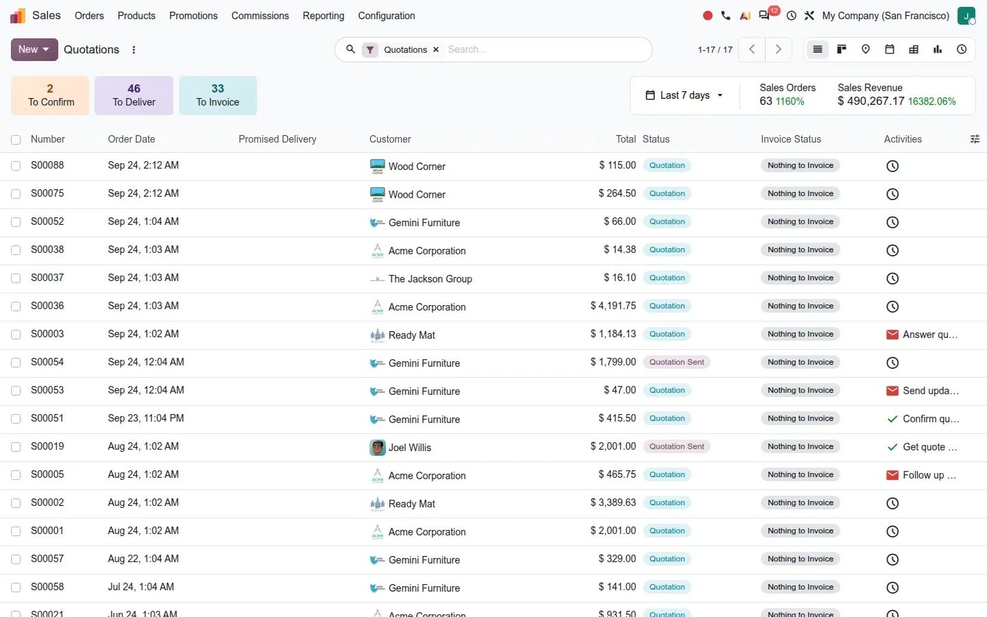
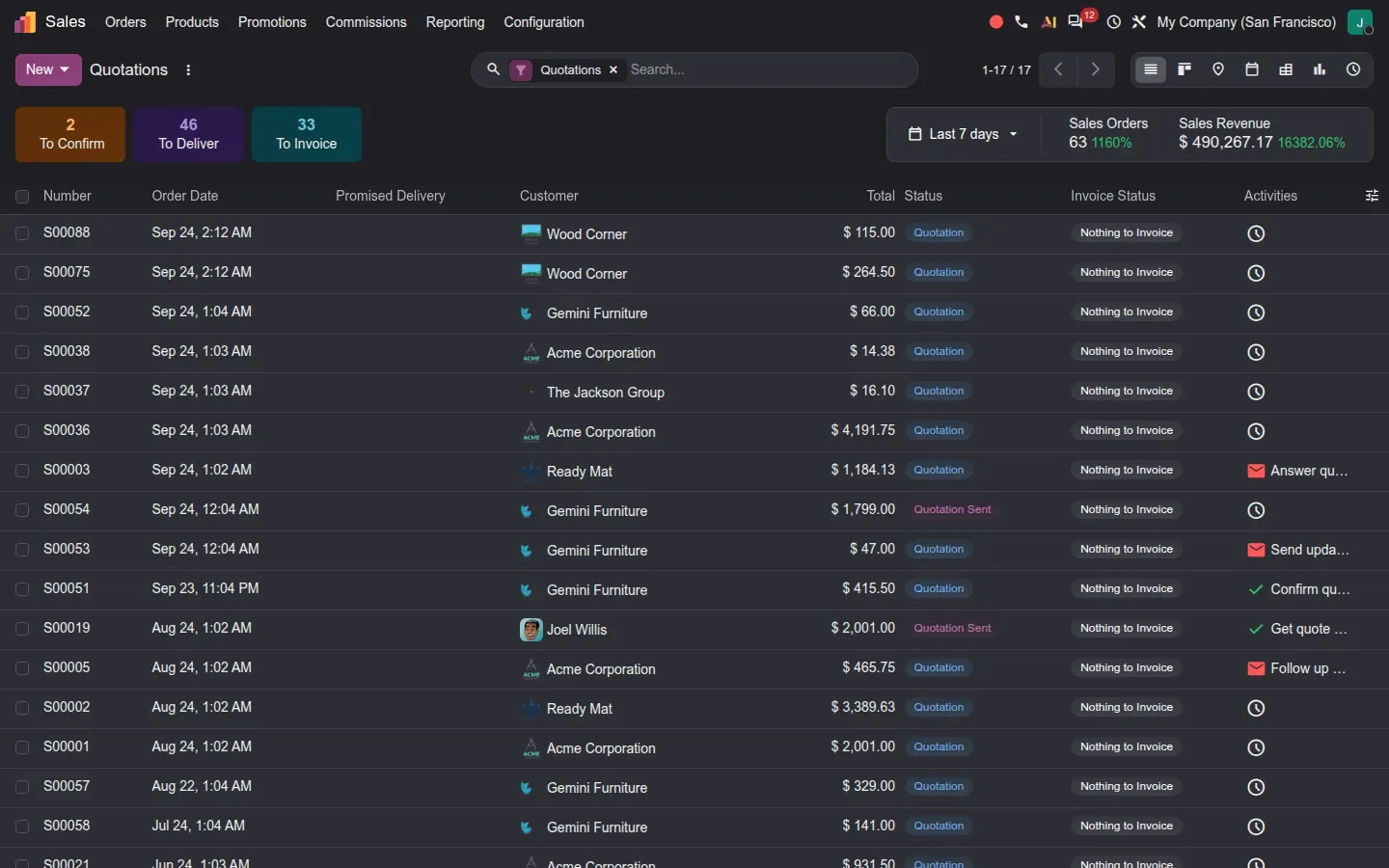
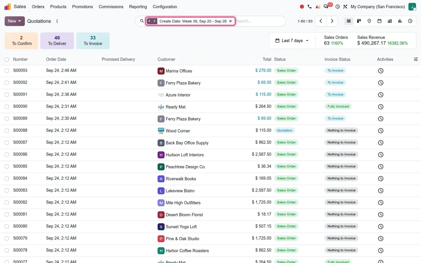
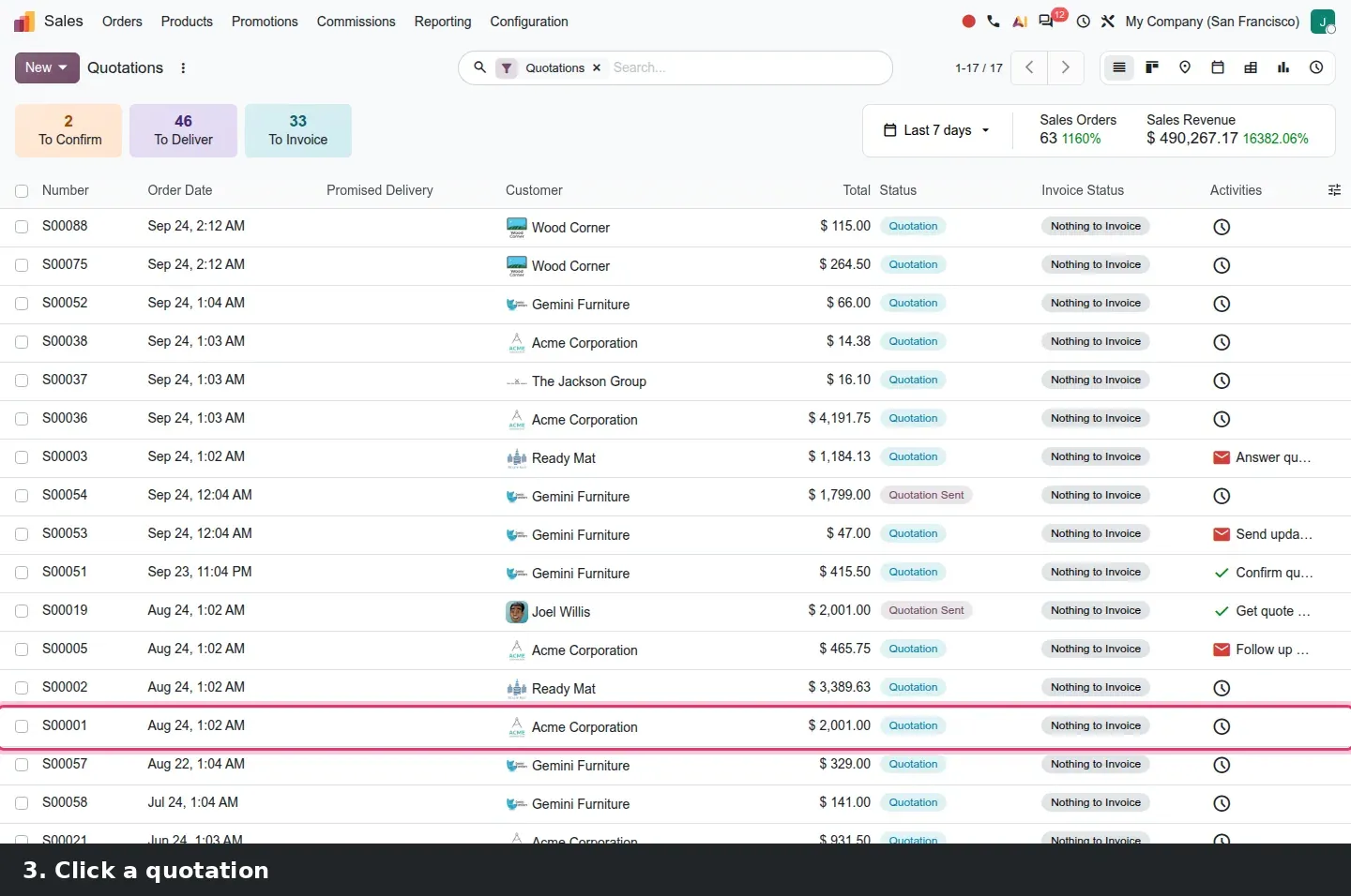
Most people spend their day in two places: a list and a form. Open Sales > Orders > Quotations on the pre-release build and the control panel is where the redesign earns its keep. The search bar sits in the centre with the active filter shown as a facet, the record counter and pager to its right, and the view switcher in the same row. Below it, Sales shows its KPI tiles, To Confirm, To Deliver and To Invoice, next to a Last 7 days strip with orders and revenue. Nothing here is a new feature; the filter, group and favourite controls, the counter and the switcher are simply lined up in one calm row rather than spread over two.
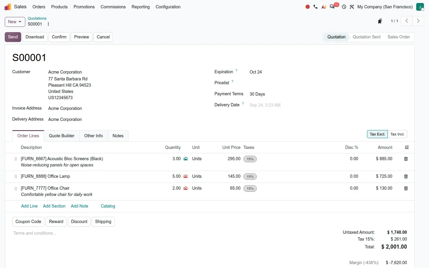
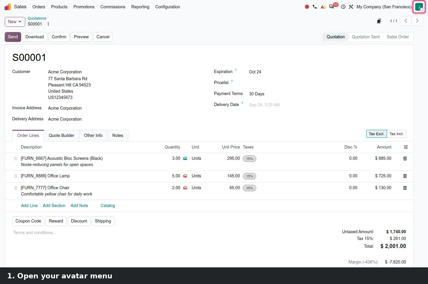
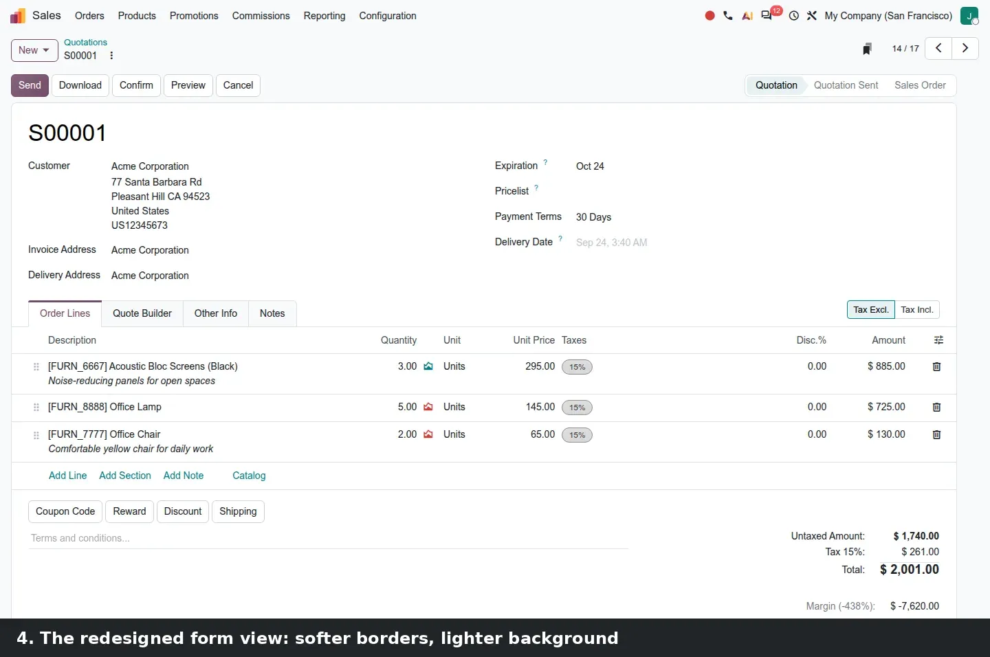
Open a quotation and the form follows the same logic. The breadcrumb, the New button and the record pager are in the top row; the action buttons, Send, Download, Confirm, Preview and Cancel, sit on the left with the status bar on the right; the record itself is a white card with more space between the header fields, the tabs and the order lines. The buttons a salesperson presses all day have not been renamed or moved. What a returning user notices is the breathing room.
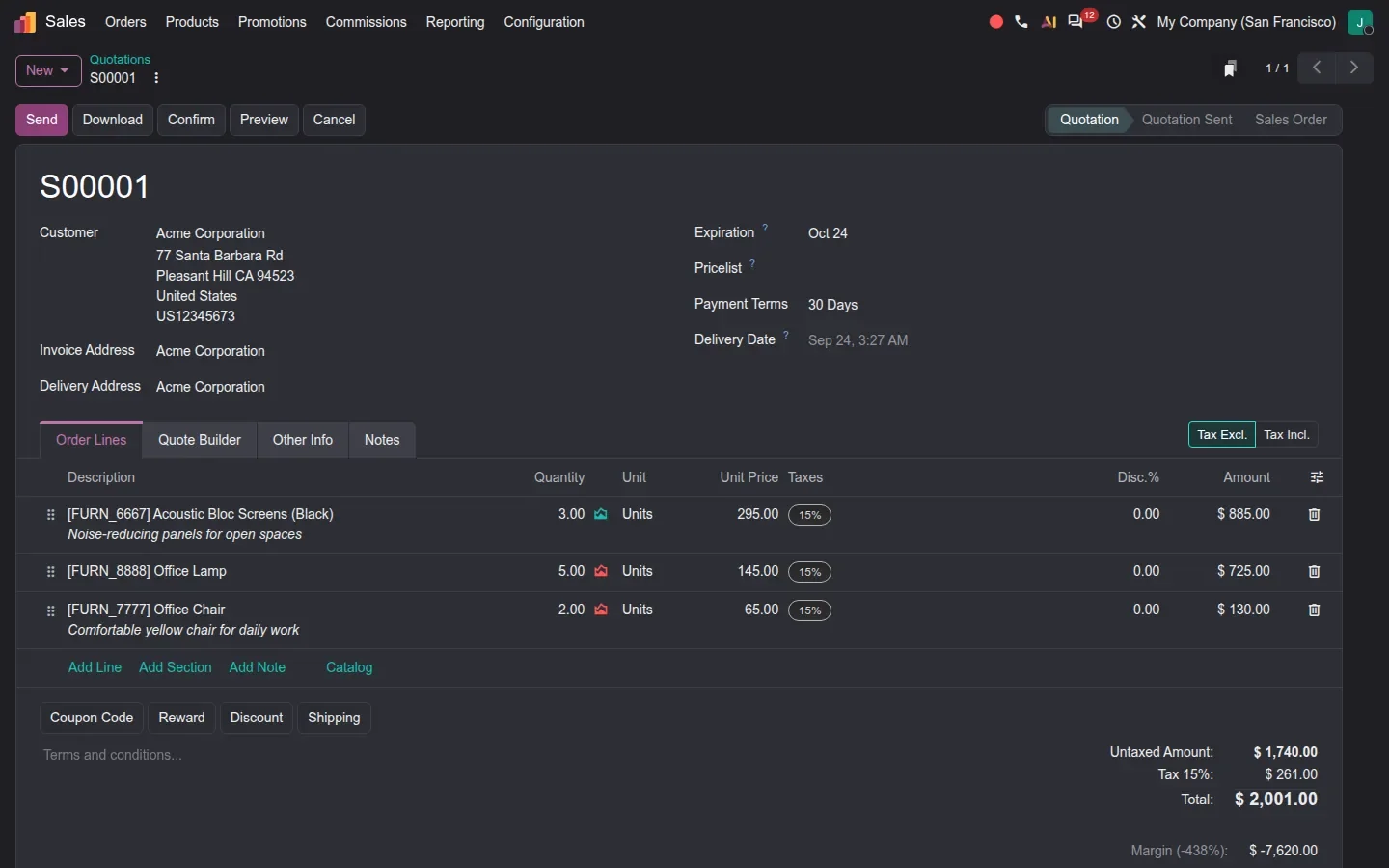
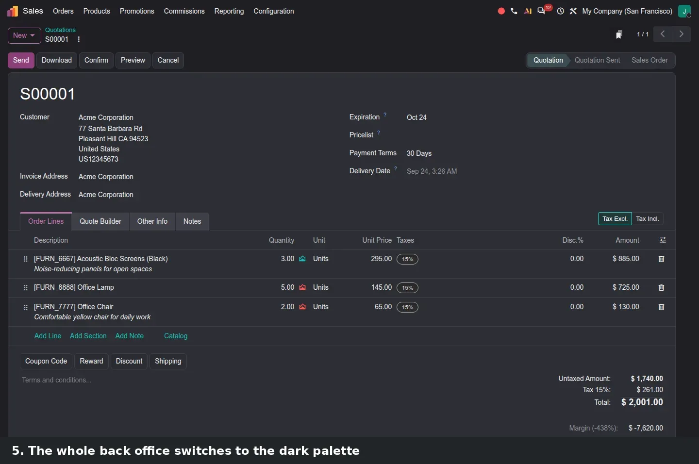
The dark theme keeps the layout to the pixel. We shot the same quotation, S00001, in both themes with the chatter hidden: fields, tabs, totals and buttons are at the same coordinates, only the palette changes, so a light-mode screenshot still works for a colleague who runs dark mode.
Dark mode is now a stored preference with a System option
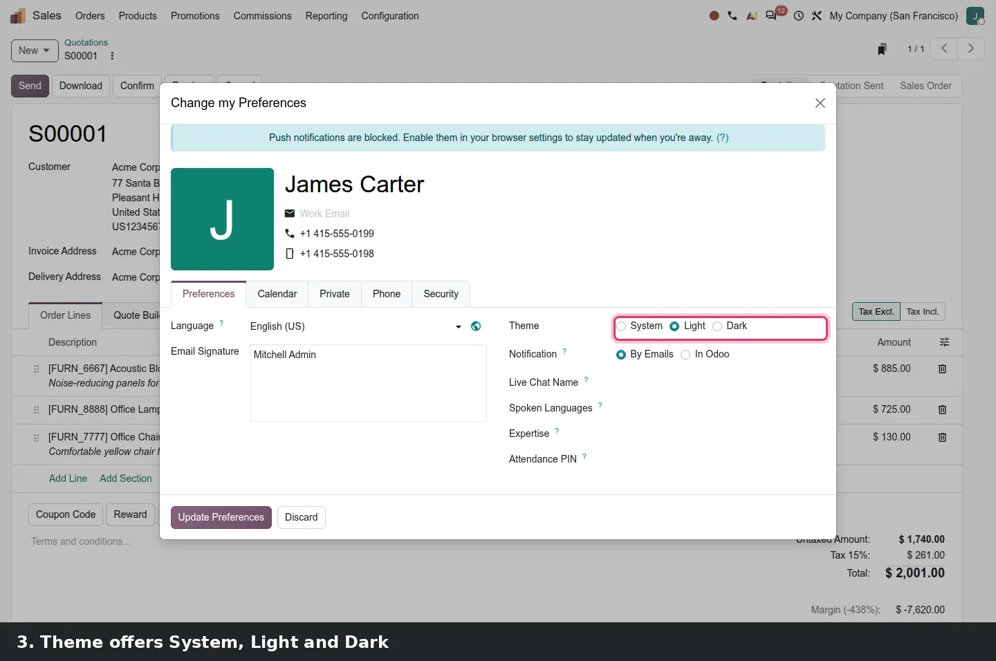
Dark mode gets real attention in this release. According to the 20.0 commit history, web_enterprise received a dedicated dark grays palette, and follow-up commits fixed contrast in dark mode for spreadsheets, VoIP, the mobile bottom sheet and the bank configuration screens. For the user, the visible change is the setting itself. Click your avatar in the top right and choose Preferences. The dialog is titled "Change my Preferences", and on its Preferences tab a radio labelled Theme offers System, Light and Dark. The save button is "Update Preferences". The choice is stored as color_scheme on the user settings record, so it follows the user rather than the browser.
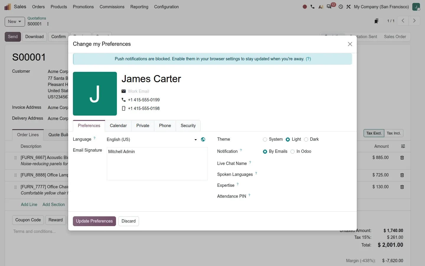
System is the option most people will want: it follows the operating system's light or dark setting, so a laptop that switches to dark at sunset takes Odoo with it. The switch takes five clicks, and after Update Preferences the form is redrawn in the new theme.
The list view in dark mode keeps the coloured status badges, the KPI tiles and the green revenue figures legible. If your team works late or in dim warehouses and shop floors, this is the setting to point them to on day one.
Set it once per user, not per machine
The theme is stored on the user settings record, so a user who logs in from a second computer or a tablet gets the same theme. On shared kiosk or warehouse terminals, pick Light or Dark on the shared account deliberately, since System follows whatever the terminal's operating system reports.
Date filters that understand "this week" and move with you
The second small addition is in the search bar. Open the Filters dropdown on any list view and expand a date filter, Create Date on the quotations list in our case. On the pre-release build the menu starts with relative options, Today, This Week, This Month, This Quarter and This Year, above the fixed months, quarters and years that already existed. The filter is relative to today instead of a fixed range: the difference between a favourite that means "this month" forever and one that meant September and went stale in October.
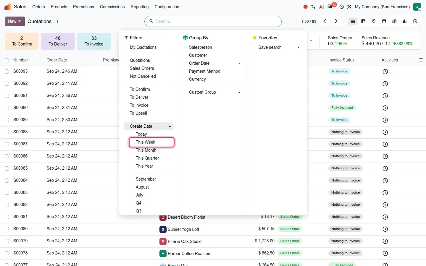
Pick This Week and the facet in the search bar reads "Create Date: Week 39, Sep 20 - Sep 26" with a previous and a next arrow on its left. Click the arrows and the period shifts one week at a time without reopening the menu. For anyone who reviews orders, invoices or tickets period by period, this replaces a lot of clicking, and a favourite named "This week's quotations" now does what its name says.
Where did it go? A cheat sheet for the first week after the upgrade
The honest answer to "where did it go?" is that, on the screens we clicked through, almost nothing moved. Apps, menus and button labels are the same; what is new is a stored theme setting with a System option, relative dates in the filters and a notice slot on the home menu. The table lists only what we verified on the pre-release build.
| Looking for | Where it is on the 20.0 build | What changed |
|---|---|---|
| The app icons | Home menu, the grid after login | New Frost icons on a light dotted background; same grid order, dark variant available |
| Light or dark theme | Avatar > Preferences > Theme (System / Light / Dark), then Update Preferences | Stored as color_scheme on the user settings; System follows the operating system |
| Filters, Group By, Favorites | The dropdown on the search bar of any list view | Same three columns; the control panel is tidied into one row with the counter and the view switcher |
| A date filter for this week or this quarter | Filters > Create Date (or any date filter) > Today, This Week, This Month, This Quarter, This Year | New relative options above the fixed months and years; the facet gets previous / next arrows |
| A message every user sees at login | Settings > Technical > System Parameters, key sysadmin.message (developer mode) | New; the value must be JSON with a message and a warning_type of user or admin |
| The buttons on a quotation | Sales > Orders > Quotations, open a record: Send, Download, Confirm, Preview, Cancel | Same labels and positions; more spacing, quieter background, identical layout in dark |
What to tell users on day one, in one sentence: your apps and menus are where they were, the screens are lighter, and you pick your theme under Preferences. For the people who build reports, add: use the relative date filters when you save a favourite.
How to try it on a demo database
- Log in to a 20.0 demo database with Sales installed, so the home menu and the views have real content. Press the home icon in the top left to return to the home menu from any app.
- Open Sales > Orders > Quotations. Look at the control panel: the search bar with the Quotations facet, the counter and pager, the view switcher, and the KPI tiles below.
- Click a quotation to open the form.
- Click your avatar in the top right and choose Preferences. In the "Change my Preferences" dialog, set Theme to Dark and press Update Preferences. Open the same quotation again and compare.
- Back on the list, open the Filters dropdown, expand Create Date and pick This Week. Use the arrows on the facet to move to the previous week.
- With developer mode on, go to Settings > Technical > System Parameters, create
sysadmin.messagewith a JSON value such as{"message": "Planned maintenance on Saturday", "warning_type": "user"}, then return to the home menu.
What we could not verify on the pre-release build
We did not shoot the System theme separately, because it renders as Light or Dark depending on the operating system; we confirmed only that the option is there and saves. The dark-mode contrast fixes for spreadsheets, VoIP, the mobile bottom sheet and the bank configuration screens, and the Frost adaptations of the kanban, graph, pivot, calendar and Gantt views, come from the 20.0 commit history; we compared only the Sales list and form views in both themes. Everything else on this page was clicked through on the 20.0 Enterprise build of 23 September 2026.
What this means for an upgrade
If you run Odoo 17, 18 or 19, the Frost redesign is the part of the upgrade every employee will notice and the part that needs the least retraining: menus, apps and button labels stayed put on the screens we tested. Plan for three things instead. Refresh your internal training screenshots, since the old ones will look dated even though the clicks are the same. Decide on a theme policy for shared terminals, because the setting now lives on the user, not the browser. And check any custom theme, CSS override or Studio tweak on the control panel or the form layout before go-live, since the views were rebuilt for Frost. That visual check is part of our migration service, and the series hub lists the deeper changes in each app that deserve more attention than the new look.
Frequently asked questions
What is the Frost redesign in Odoo 20?
Frost is the internal name for the Odoo 20 visual refresh of the Enterprise web client. According to the 20.0 commit history it covers the form, list, kanban, graph, pivot, calendar and Gantt views and the control panel, with lighter backgrounds, softer borders, new app icons and a tidier search bar row. Menus and button labels are unchanged on the screens we tested.
How do I turn on dark mode in Odoo 20?
Click your avatar in the top right, choose Preferences, and in the "Change my Preferences" dialog set Theme to Dark or System, then press Update Preferences. The screen is redrawn immediately. The choice is saved on your user settings, so it follows you to any computer you log in from.
What does the System theme option do?
System makes Odoo follow the light or dark setting of your operating system. If your laptop switches to dark in the evening, Odoo switches with it. On screen it looks exactly like Light or Dark, which is why we did not capture it separately on the pre-release build.
Did any menus or buttons move in the Odoo 20 interface?
Not on the screens we clicked through. The home menu keeps its grid, Sales > Orders > Quotations keeps its menus, and the quotation buttons Send, Download, Confirm, Preview and Cancel keep their labels and positions. The changes are visual: spacing, colours, icons, and a control panel gathered into one row.
How do I show a maintenance message to all Odoo users?
With developer mode on, go to Settings > Technical > System Parameters and create the key sysadmin.message. The value must be JSON, for example a message field and a warning_type of user; plain text is rejected. The notice then appears above the app icons on the home menu. Use warning_type admin to show it to administrators only.
Will my custom theme or CSS still work after upgrading to Odoo 20?
Treat it as unverified until you test it. The list, form and control panel were rebuilt for Frost, so CSS overrides, custom themes and Studio layout tweaks that target the old structure can break or look out of place. Run a visual check on a test database before go-live, in both light and dark themes.